

Atlanta History Center
The Product: The Swan House Hunt
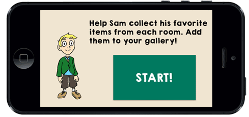
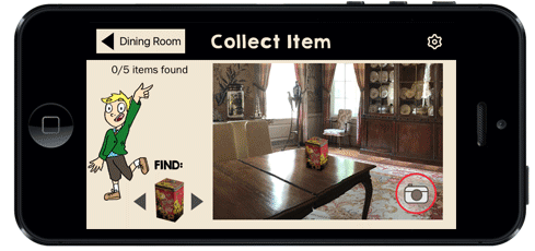
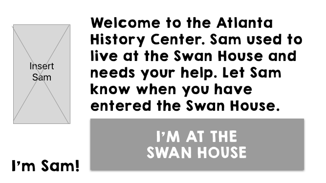
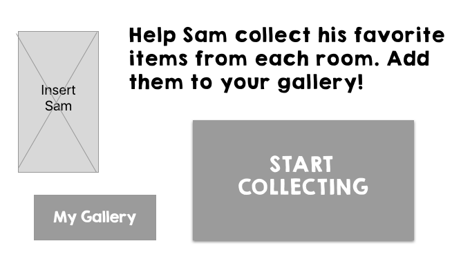
Swan House Hunt is a mobile app scavenger hunt game geared for children ages 6 to 9 years old to be used at the Swan House exhibit in the Atlanta History Center.


The Case Study
UX Team: Lauren LaRochelle, Ally Weatherly, Christine Yun
This case study started with simply how can our UX team help the Atlanta History Center? The research started with the AHC to learn more about what realistic problems or shortcomings our team could resolve in a two week time frame.
Tools Used: Google Forms, Axure, Sketch, InVision
Skills Used: Interviewing, Research, Data Synthesis, Information Architecture, Sketching, Wireframing, Prototyping, User Testing
Research
Research started getting to know the Atlanta History Center (AHC) to better gauge how our UX team could assist. I put together a survey for AHC staff and conducted interviews with staff on site. The Swan House Exhibit became a quick focus, and the lack of interest from younger kids.

"The Swan House is the number 1 reason people come to the AHC"
- Jami, AHC Employee

"Children. They do not enjoy old homes.:
- Chuck, AHC Employee
Our team visited the Swan House and I made observations on how children could currently interact and learn at the exhibit. There were 2 child-engaging factors at the house. The first is table with paper, pencils, and drawing tools where kids were invited to "Draw your own Dream Home." The second is the children's room in the home. It's the only room not roped off where kids can enter, be hands-on, and play with the toys.


Once we decided to hone in on children's engagement at the Swan House, I built a screening survey sent out to the public to learn more about Atlanta museum goers. Our screener received 61 responses.

A screening survey gave us insight to families and their museum habits.
Percentages of WHY people typically visit Atlanta museums
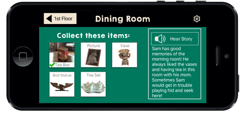
I conducted follow-up interviews to learn about the families visiting Atlanta museums, and what their children's technology exposure. I also wanted to know how the children learn best. The team decided to add an audio button on the screens with text. This not only gave the children the option to hear what the screen had to say, but would potentially help the noise factor in a museum that is typically quiet.

The user screening and interviews narrowed down the user to form two persona profiles:
Primary Persona Profile

Secondary Persona Profile

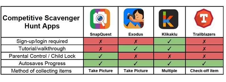
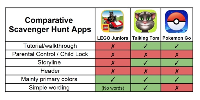
During user interviews, we asked the children what their favorite apps were to play on the phone or tablet. We used some of those as our apps to do a comparative analysis to see what level of technology and difficulty the children were comfortable with. I also noted the color schemes most of these apps had. A wide variety of bright colors seemed to be standard.
Competitive Analysis
Comparative Analysis
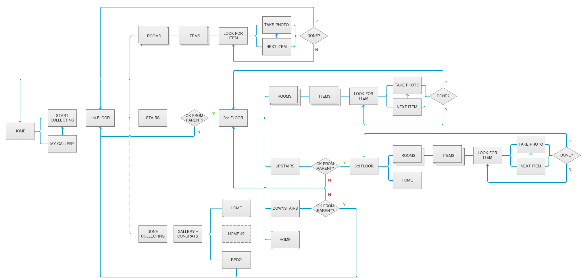
Architecture
The site map and flow chart were built in Axure.
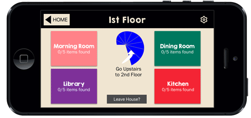
Site Map

User Flow Chart
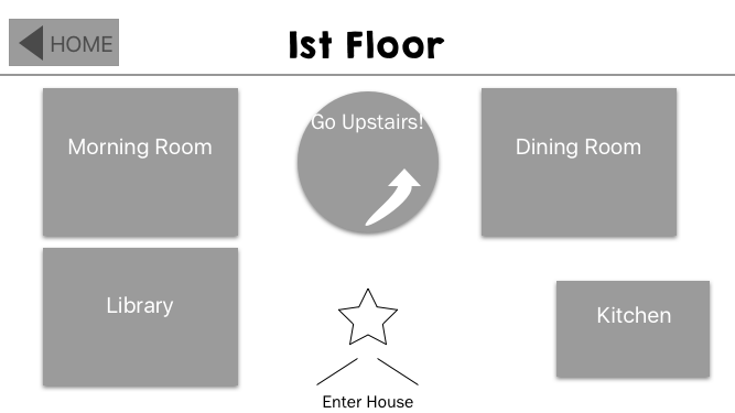
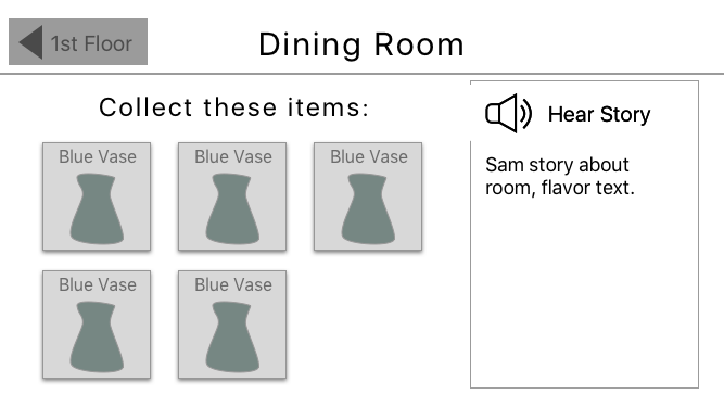
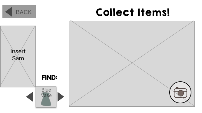
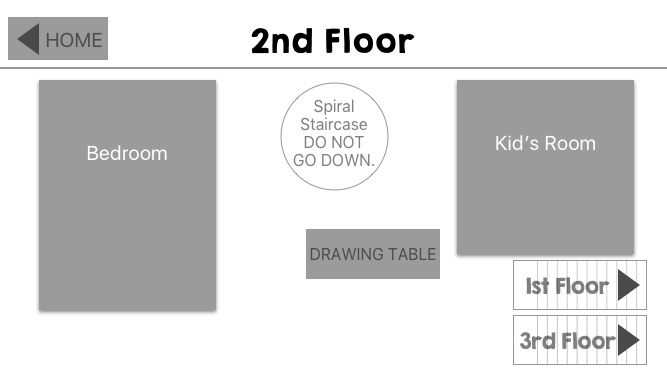
Wireframes
The initial low fidelity wireframes I created in Sketch. Our team used InVision to collaborate on wireframes, edits, and prototype building.

Testing & Iteration
Objectives
The main objectives I was testing for were around graphics, navigation, clear instructions, and the parent approval pop-up.

Testing
We tested with mid-fidelity wireframes. I typically like to do my first round of testing with lo-fi wireframes, however testing with a younger demographic I felt there was too much of a cognitive leap expectation with those wires.
Iterations
The first round of testing with 9 users (of which I tested 3) gave great insight to children's expectations and their comfortability with technology. Here are some results:

Star Graphic
The star graphic (circled in red) was included to mimic the star pattern in the floor tile of the house to help with location association when the user is in the house. A few users tried clicking on it. One suggested actually making it a button.

Resolution
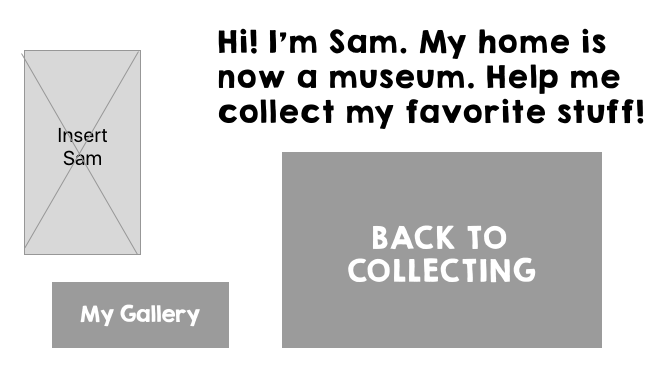
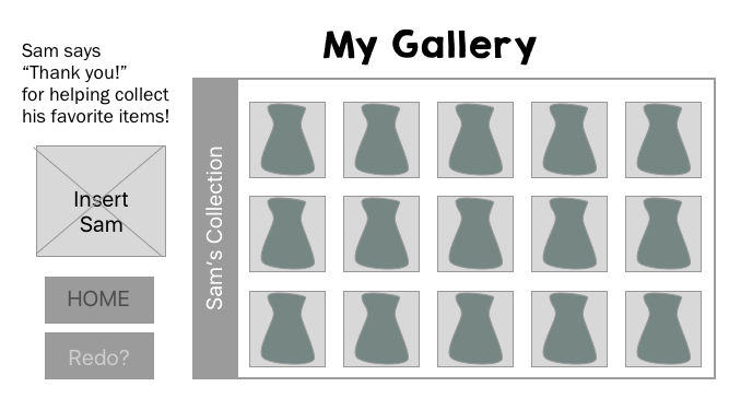
Here's the final comp after iterations. The star graphic was removed and replaced with a button (Leave House?) that would actually serve as an indicator of when the user is leaving the exhibit and would prompt the option to view the gallery of the user's collected items.

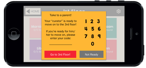
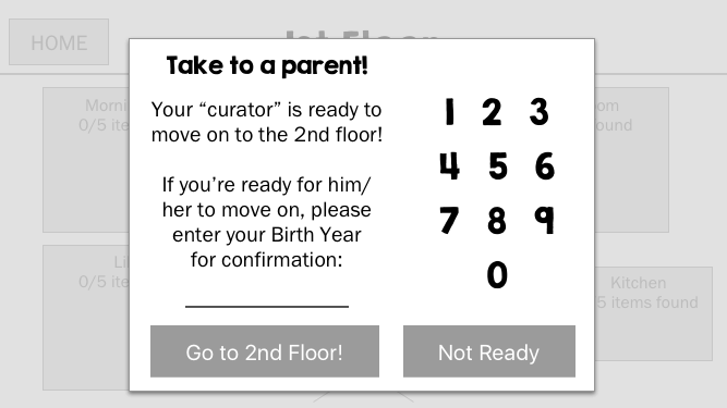
Parent Approval
This became a consistent obstacle during user testing. Kids either froze, tried clicking out of the screen, or said "I don't know what to do." Additional interviews with parents were conducted around this piece.

Resolution
It became apparent that the on-boarding process needed further tutorials that would encompass this approval process. During on-boarding, parents would be informed of this and have the option to disable it. If they keep it, they would set their personal code for confirmation.
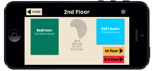
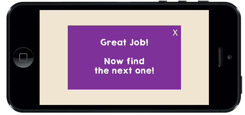
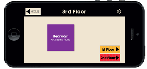
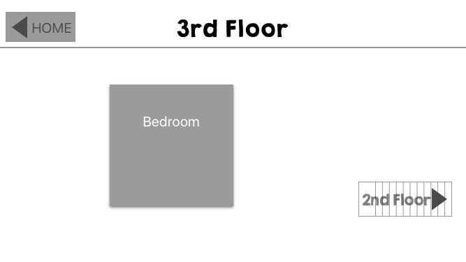
Other iterations included: adding more tutorials as the user reached different stages of the game, adding quick access buttons on the 3rd floor screen, and removing access to the gallery until the end of the game.
Branding
I created a simple style guide for the app. The AHC already has a very colorful palette they use throughout their website and museum. It was appropriate to utilize the same colors throughout the app since we found in our research that children enjoy bright colors and they are commonly used in children's games. The typeface for headlines was chosen because it is a playful font, yet still bold and legible. The body copy font was chosen mainly for legibility, especially in smaller font sizes.

Final Comps