

Auto Connect
Connect your car's computer to your phone. Decipher dashboard lights & stay on top of maintenance schedules.
Tools Used: Google Forms, Axure, Adobe XD, Adobe Illustrator
Skills Used: Surveys, Interviewing, Research, Data Synthesis, Information Architecture, Sketching, Wireframing, Prototyping, User Testing
Research | Architecture | Wireframes | Testing & Iteration | Prototype
Auto Connect is the result from a case study on the communication between vehicles and their owners. Most humans have computers in their hands (smartphones) and vehicles have computers. I felt there was a gap in how those computers can talk to each other. I wanted to learn more about how car owners felt about communicating with their cars and how technology can make their experience better.
Research

To get an overview of how people viewed their car and what pain points are there, I started my research started with an online screening survey. After receiving 84 responses and conducting follow-up surveys and phone interviews I was able to hone in on patterns and discern who my users are.
Here's what the data revealed:

Q: How do you know when your vehicle needs maintenance?
“I get a light on my dashboard or my car no longer moves.”
Persona Profile

Competitive Research
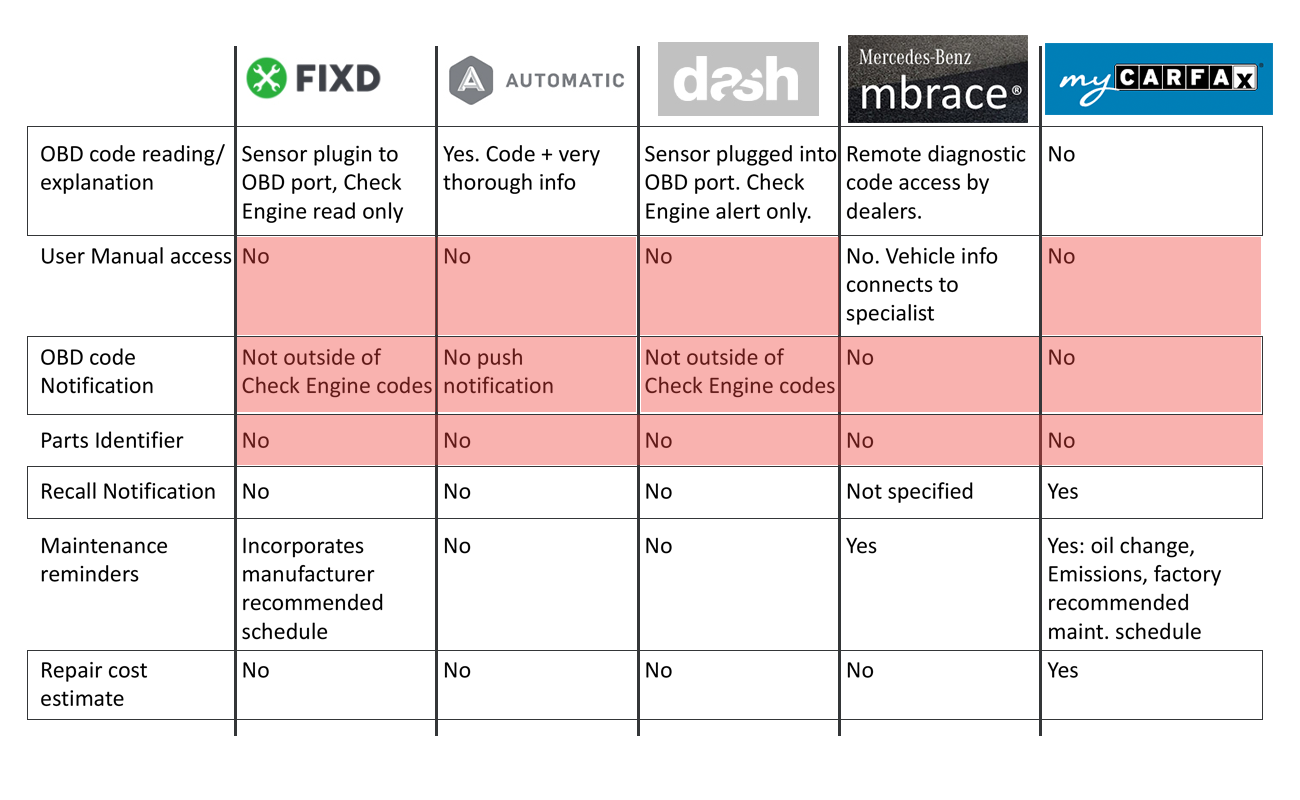
Now that I have a grasp on my users and their pain points and needs, I started to see what else was out there in this space. I was surprised to learn of a few apps that were approaching these needs, but none that seemed to truly solve the problems my users were facing.
Mechanic Interviews
I realized I needed to include another aspect of this industry in the conversation. I conducted interviews with a couple auto mechanics to gain their insight and perspective on OBD error codes, diagnosing problems, and how they would respond to some potential user scenarios Auto Connect would create for the mechanic.

I was able to better understand the car computer diagnostic system and how it generates OBD codes.
"The OBD code is not diagnostic. It's just a starting point for a mechanic to find the problem."
Architecture

Conceptualizing the product via whiteboard. I wanted to visualize all the players on the field, how the app could communicate to each player, and understand the value add of each piece.
Outlining the MVP (Minimum Viable Product)
After reviewing these concepts and the user's needs, I felt it was important to build out an MVP to stay on track and focused during the solution design ahead.

Site Map
Starting with the site map, there is quick access to most the information the user needs only being a click or two away.

Flow Chart
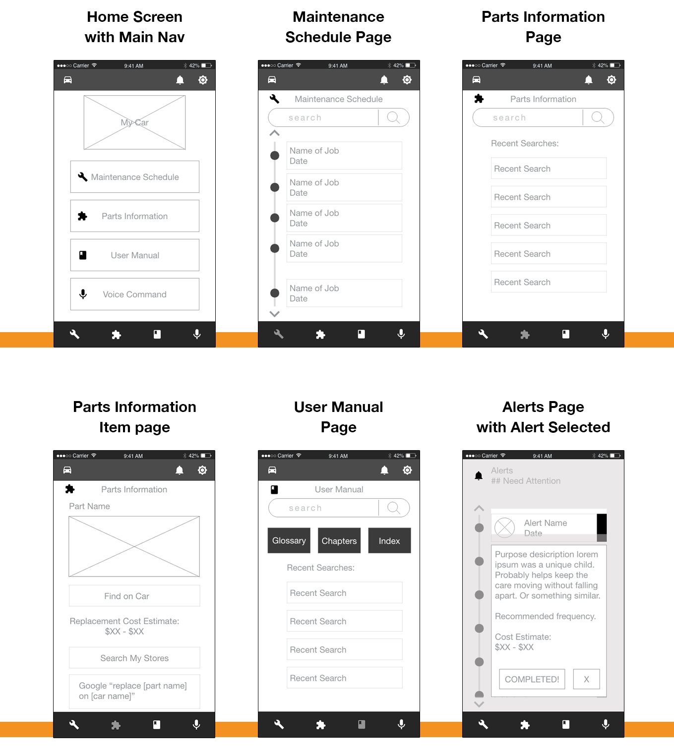
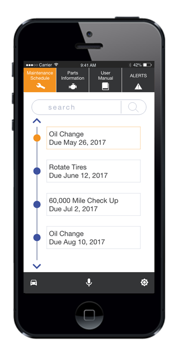
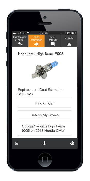
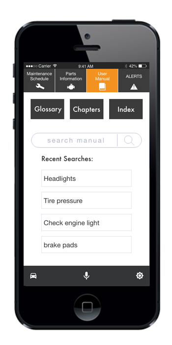
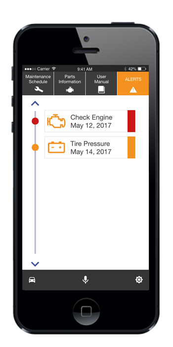
This flow chart shows the journey through the main menu where the user can; check their maintenance schedule, view information on specific auto parts, navigate their user manual, and view any alerts from the OBD error code system.

Sketches
So how do I visualize all this information? Sketching allows me to really design for the user by putting myself in their shoes and think about what they would want to see on each screen. Here I can contemplate the best time to use icons, animations, labels, etc. This is a visual brainstorm.

Wireframes
After sketching screens, I created low fidelity wireframes in Adobe XD.
Testing & Iterations

I started user testing the low fidelity wireframes in a clickable prototype through Adobe XD.
My main testing objectives:
• Alert icon discoverable?
• Layout for maintenance page effective?
• Button names & icons effective?
Testing & Iteration Results
“[Alert icon] seems more like a notification, I didn’t think that’s where an alert would be.”
Multiple testers had trouble identifying the alert icon. I revised and tested a couple options before changing the icon and moving it into the main navigation.

“I don’t know what these icons stand for.”
Multiple testers showed a disassociation with the icons and their destinations. I edited some icons and added the page name to the top bar navigation.

Branding
Now that the product has taken shape, I am able to brand with typography, color schemes, and an app icon.

Final Comps
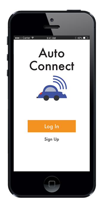
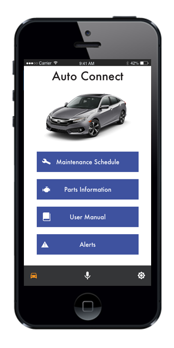
I applied the branding to high fidelity wireframes and was able to do a round of testing and iterations with a completed prototype.
Prototype
Next Steps
My next steps would be:
• Do more testing on the prototype specifically around how people would use the User Manual
• I would want to look into further customization based on user's "do-it-yourself" preferences.
• Research "how to" videos and instructions on do-it-yourself repairs and look at the potential of having proprietary content